
Creating Pivot chart for ALM reporting. – User friendly Tech help
How we created our automation progress report from ALM to Email in 30 minutes?
n
nRequirement:–
nWe need to showcase our management regarding the progress in Automation.So rather than giving them quantitative data we thought of sharing it in more presentable manner using Pivot charts.
n
nHope it help our fellow automation friends in creating easy and rapid reports.
nPlease feel free to share Your experience as comments, as we always believe sharing is caring.
n
nDo follow us for more updates FB,LinkedIn,G+
n
nDownload dummy Excel
n
nSolution:-
nStep1:- Getting Data from ALM(Application life cycle management),
n
nNote:- It can vary depending on the management tool which is used in the organization but still the approach would be same.
nA)Testing -> Test Plan -> Select the Test Folder -> Live Analysis Tab -> Click on ‘Add Graph’
n
n
n
B)Select ‘Summary Graph’ -> Click Next
n
n
n
C) Select any value for X-axis field -> Click Finish
n
n
n
D)Graphical view would be generated -> Click on the bar graph tower
n
n
n
E)Drill down Results window opens
n
n
n
nThis is what we were waiting for, we can change what all the columns we need in our report.Further we would export the report in Excel format.
n
n
 |
| Selecting columns in Drill down results view |
n
 |
| Exporting excel from Drill down results |
n
n
nStep2:-Creating Pivot Chart
nA)We have our required data in Excel,we can edit to make any required changes like headers or any other modification.
nB)Insert -> Pivot Chart
n
n
n
C)Select the Table/Range for Pivot Chart -> Click Ok
n
n
n
D)Select from “Pivot Chart” Fields, the columns that we need to displayed in Pivotchart report
n
n
nCheck the two variations of graph when we changed the data under Axis and Values.
n
n
n
 |
| Pivot chart view-1 |
n
 |
| Pivot Chart view-2 |
n
n
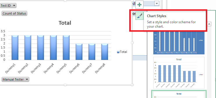
Step3 :- Playing with the design of the Pivot chart
nOne’s our chart is ready we can change the color or display design (Like pie chart) to make it look more impressive and easy to comprehend
n
nJust select chart -> click on brush
n
n n
n
n
We can also change the shape of graph, INsert -> Charts -> Select the chart option as suitable(Do select the chart below to check the live effect)
n
n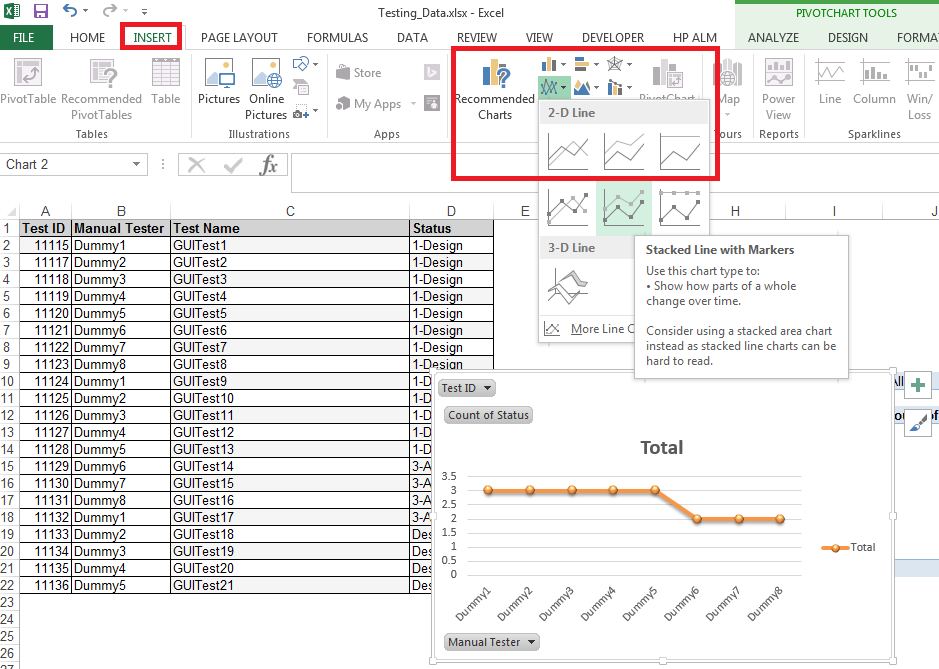 n
n
ReRun ALM test
nLog BUG in ALM using OTA
nLearn Selenium